TYPE
DESIGN
FOR
DISABILITY
Font to show differences in pronouncing a letter in the context of a word that can be understood intuitively.
Published
Page Online
Page Magazine
︎
Human-centered Design
Design Research
Participatory Design
Research Synthesis
Qualitative Research
Ethnography
Systems Thinking
Creative Problem-solving
Strategy
︎
Visual Perception
Cultural Psychology
Minority Psychology
Disability
Behavioral Science
Attention
Trust
Trauma
︎
Type Design
Typography
Layout
Book Binding
Concept Creation
Coding
INTRO
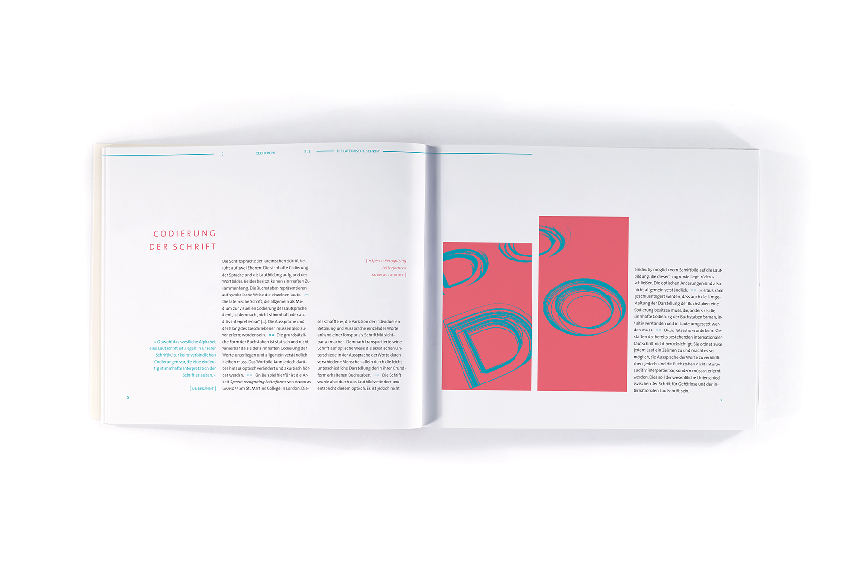
Without the ability to hear, learning how to speak is a challenge one can barely meet. Without it, people neither know how words should sound nor how they sound when they pronounce them, not to mention that there is no way of learning how to pronounce words intuitively. However many deaf people face that challenge and succeed.
But no matter how hard they try it will not be possible to learn the tiny differences in pronouncing some words. So I started thinking of a method that could visualize those differences in a way everybody can understand.
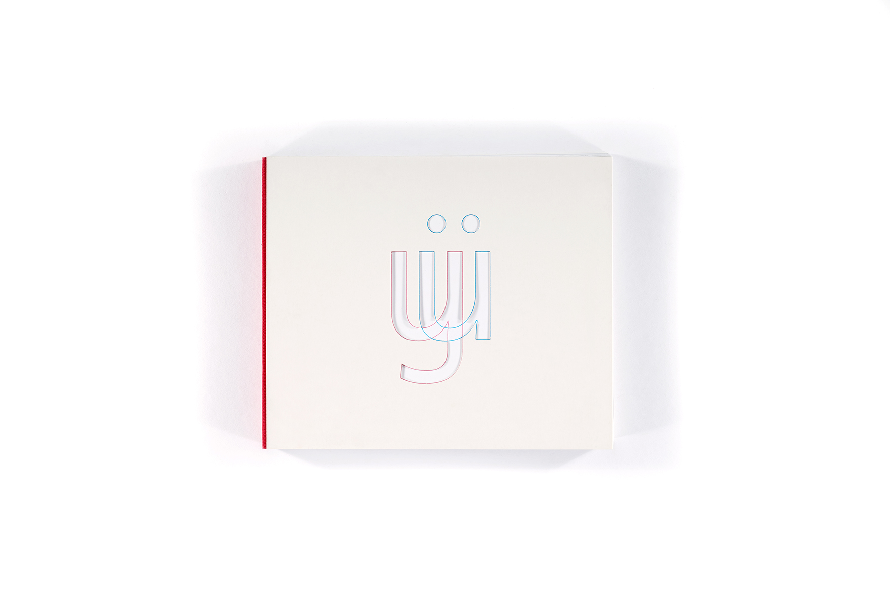
After a while I came up with the idea that there is no better way of showing how things are differently pronounced than by showing it with signs the people have already learned: The Latin Alphabet. In fact almost all the differences in pronounciation can be shown just with this limited amount of signs by replacing special letters with others. That is how this font was created.
︎
I started my inquiry of change with the following research question:
I started my inquiry of change with the following research question:
︎︎︎ How might we design a font that helps deaf people to know the differences in pronounciation of a letter in the context of a word?
︎︎
RESEARCH
My research led me to send out questionniares and conduct interviews with deaf people and their friends and relatives. I further dove deep into the fundamentals of sign language and phonetic fonts.
In addition I acquired fundamental knowledge about linguistics and the latin alphabet.
RESEARCH
My research led me to send out questionniares and conduct interviews with deaf people and their friends and relatives. I further dove deep into the fundamentals of sign language and phonetic fonts.
In addition I acquired fundamental knowledge about linguistics and the latin alphabet.
︎
Sign Language
Sign Language

︎
Mundbildschrift /
Face Typeface
Mundbildschrift /
Face Typeface
︎
pictogram font
pictogram font


︎︎
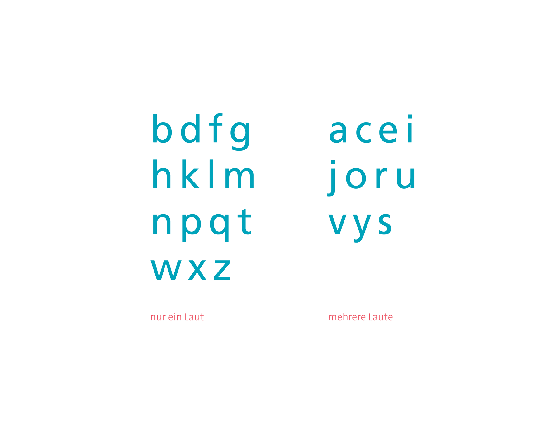
Questionnaire
The questionnaire was supposed to reveal which letters support which sound. The circles are resembling the shape of the lips when pronouncing the letter. The participants were given the choice between these different shapes to tell which is supported by the shape of the letter.
Questionnaire
The questionnaire was supposed to reveal which letters support which sound. The circles are resembling the shape of the lips when pronouncing the letter. The participants were given the choice between these different shapes to tell which is supported by the shape of the letter.
︎
phonetics fundamentals
phonetics fundamentals
︎︎
PRINCIPLES
Based on my findings I developed two principles that my design should follow.
PRINCIPLES
Based on my findings I developed two principles that my design should follow.
INTUITIVE
The font should be intuitively facilitate the right pronounciation of each letter.
The font should be intuitively facilitate the right pronounciation of each letter.
LATIN ALPHABET
The font should consist of letters from the latin alphabet in order to make it inclusive.
The font should consist of letters from the latin alphabet in order to make it inclusive.
︎︎
DESIGN PROCESS
︎
Sketches
Sketches


︎︎
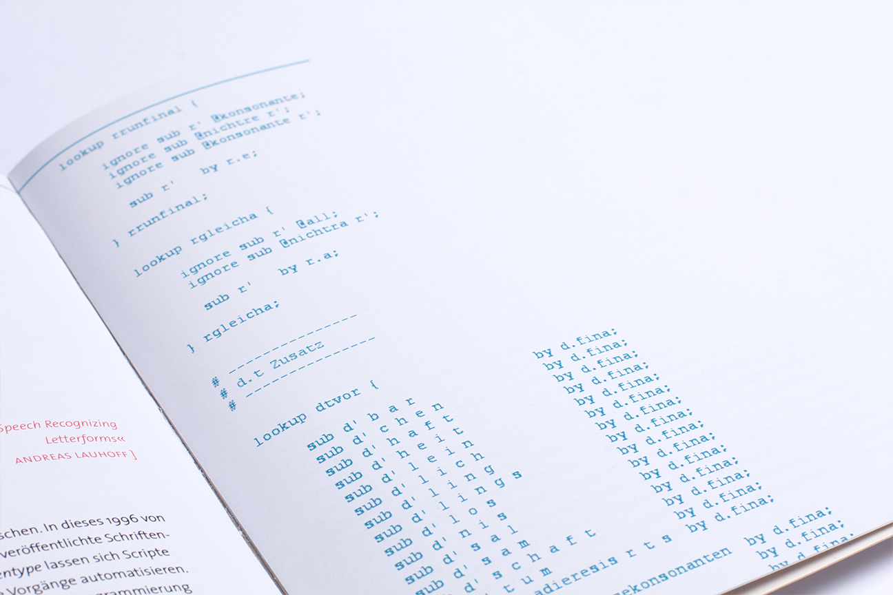
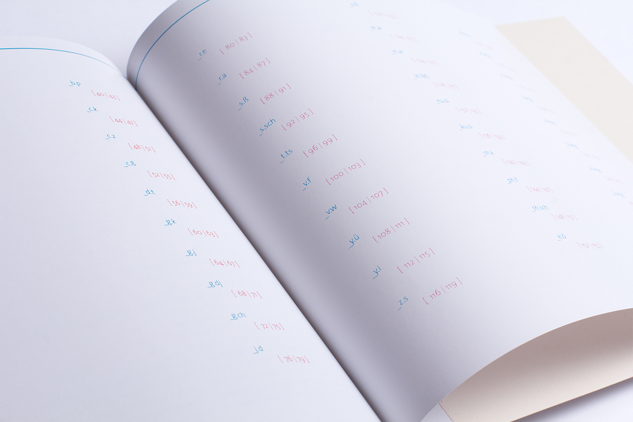
programming
programming
︎
RESULT
︎
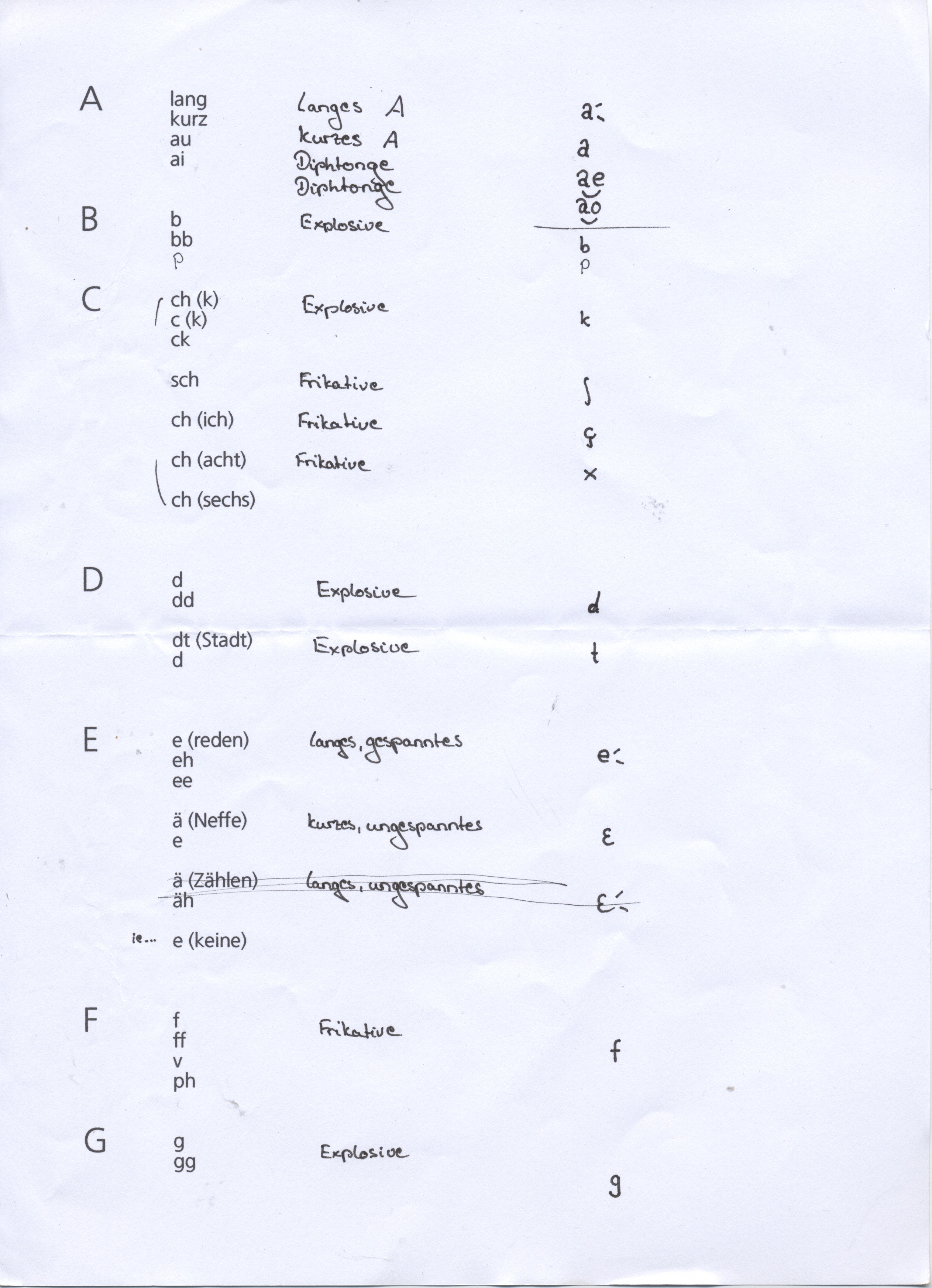
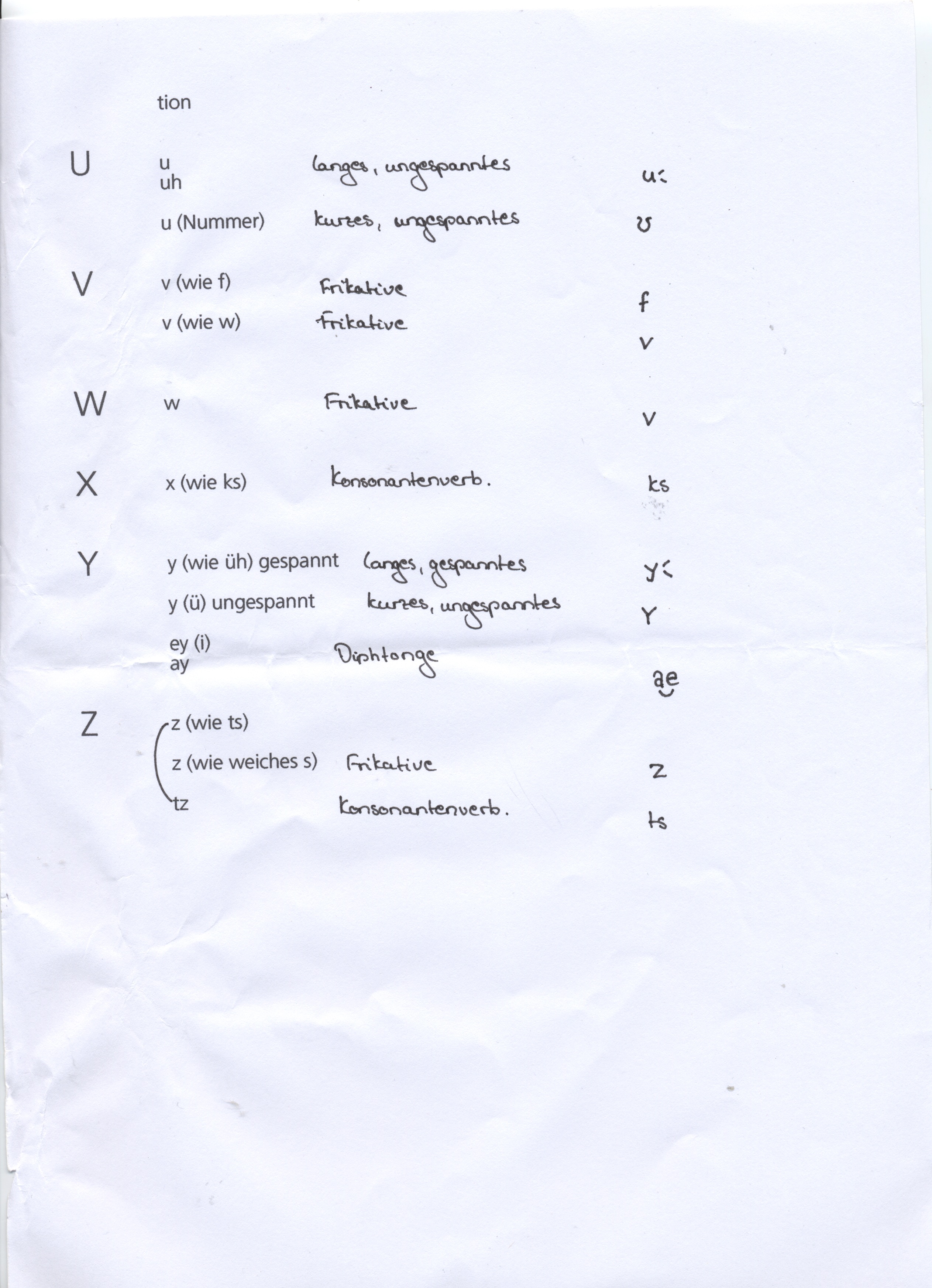
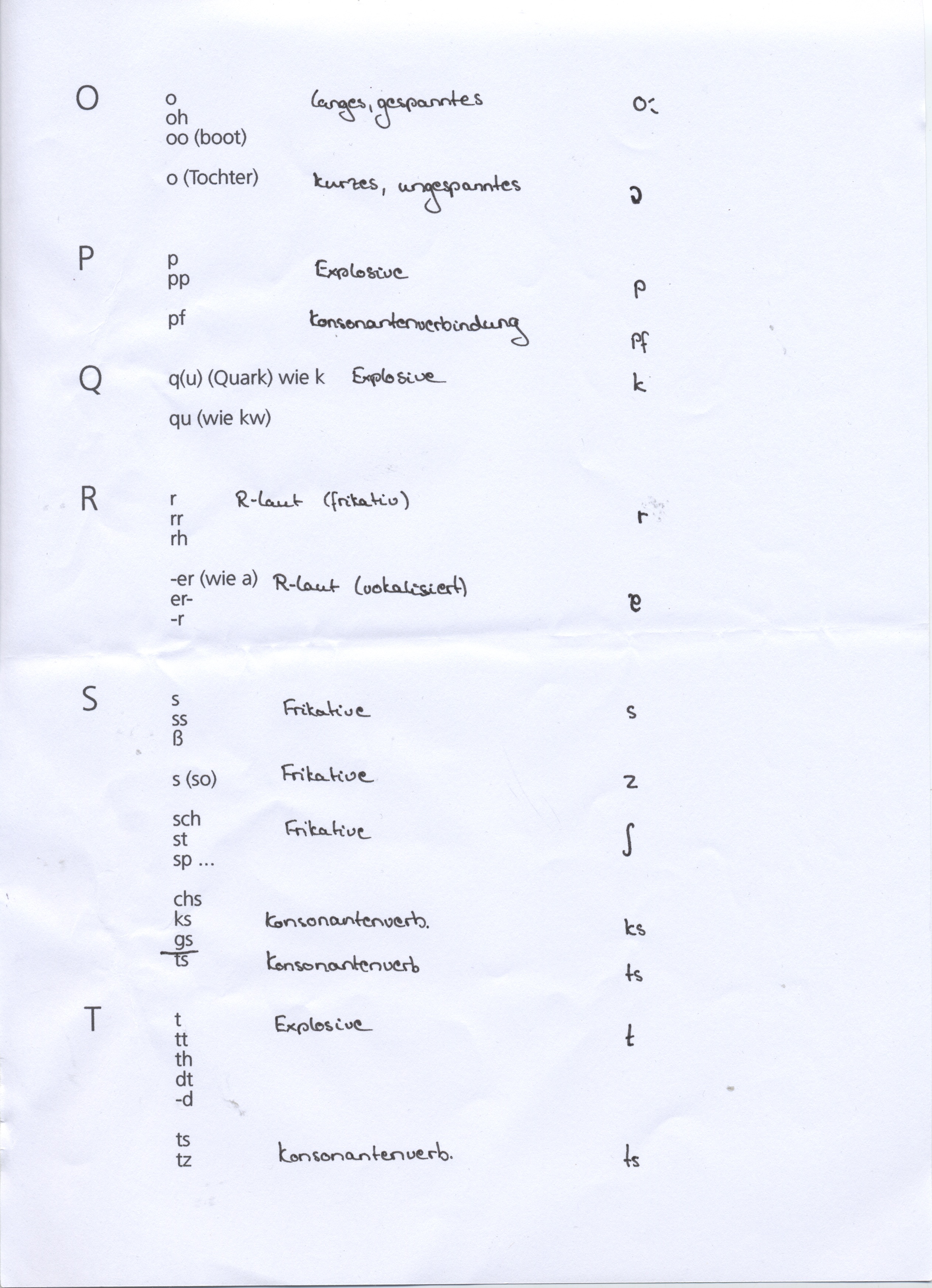
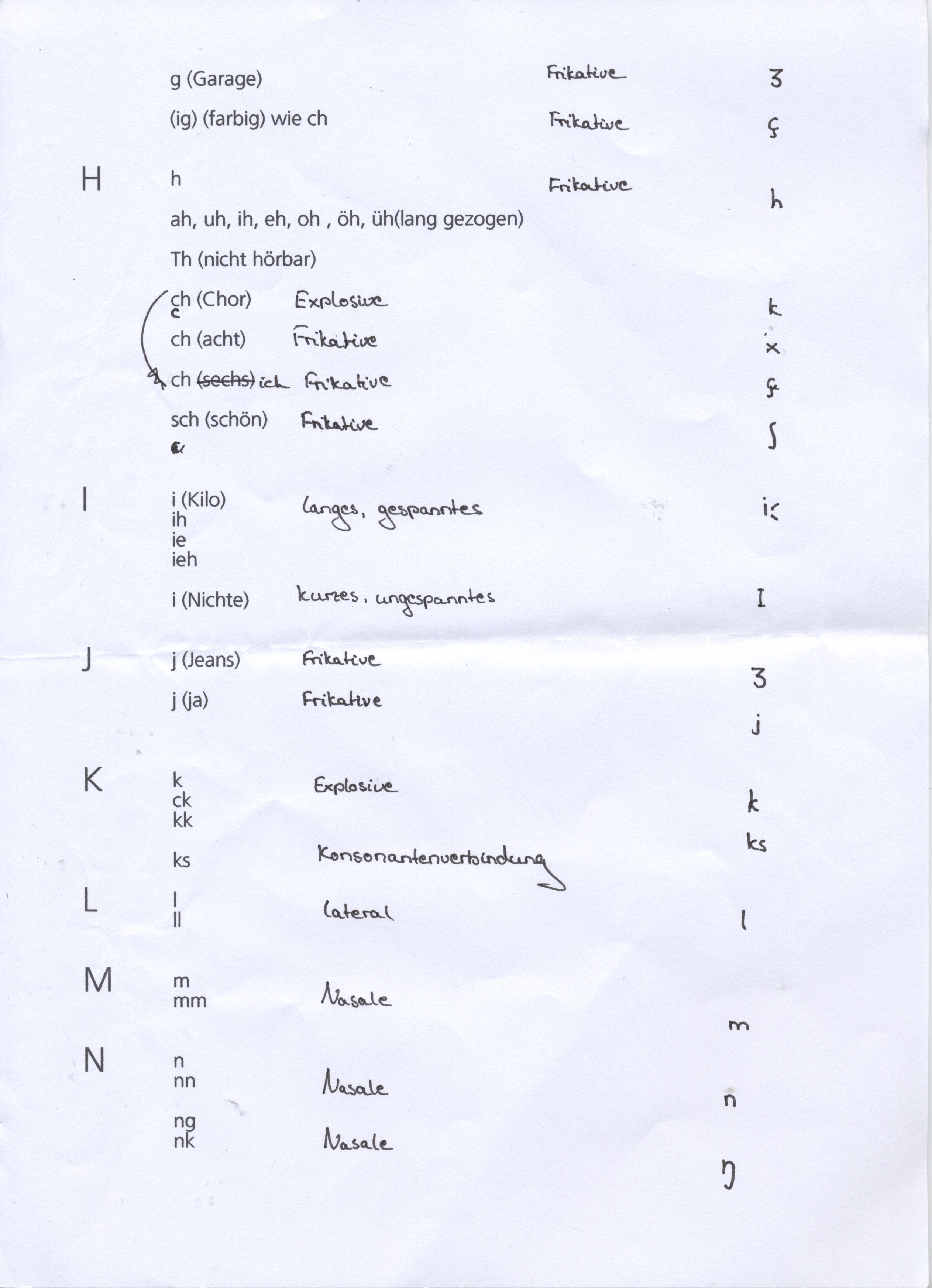
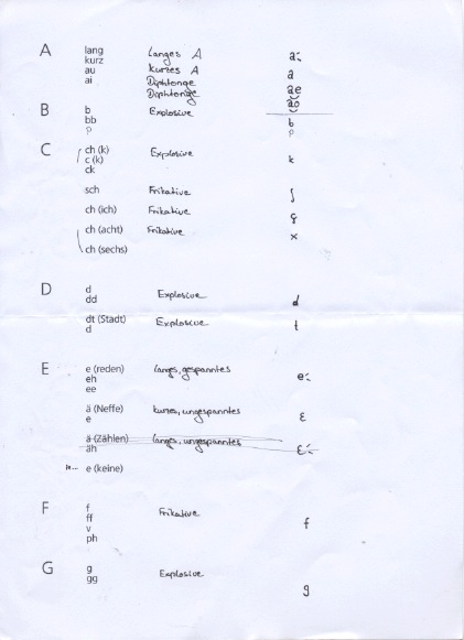
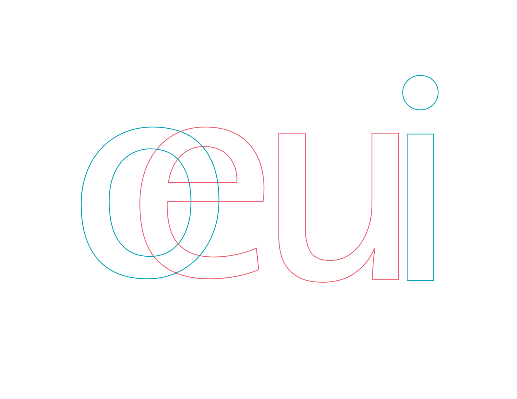
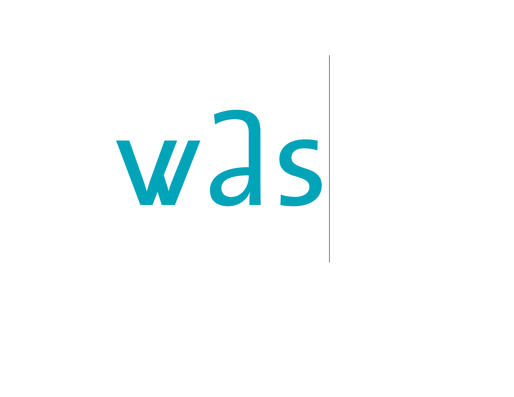
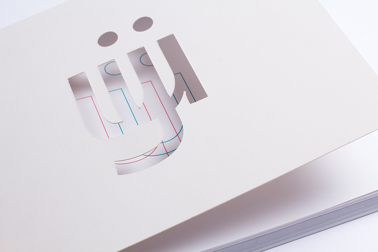
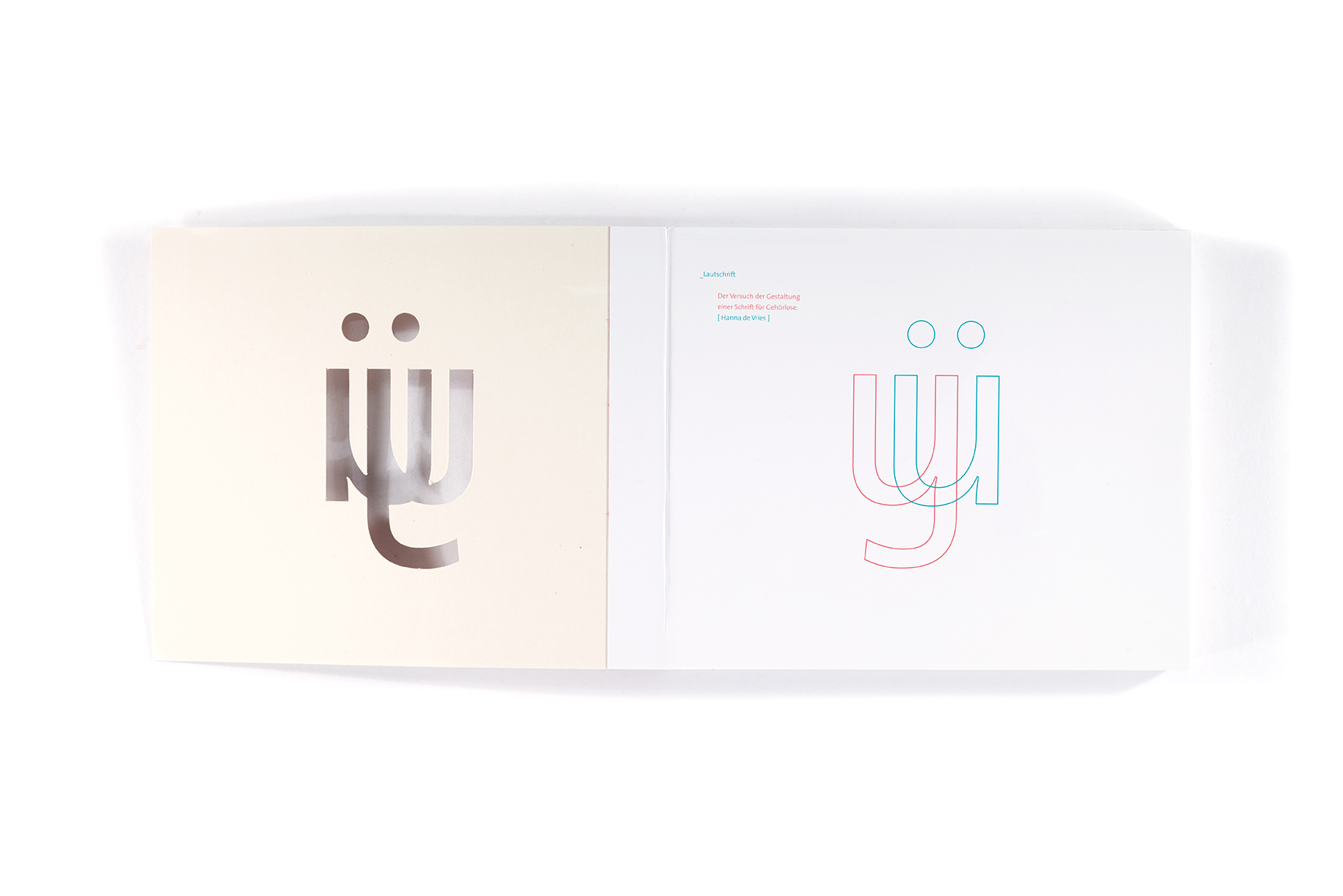
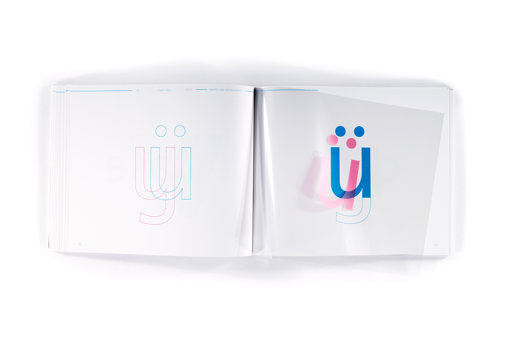
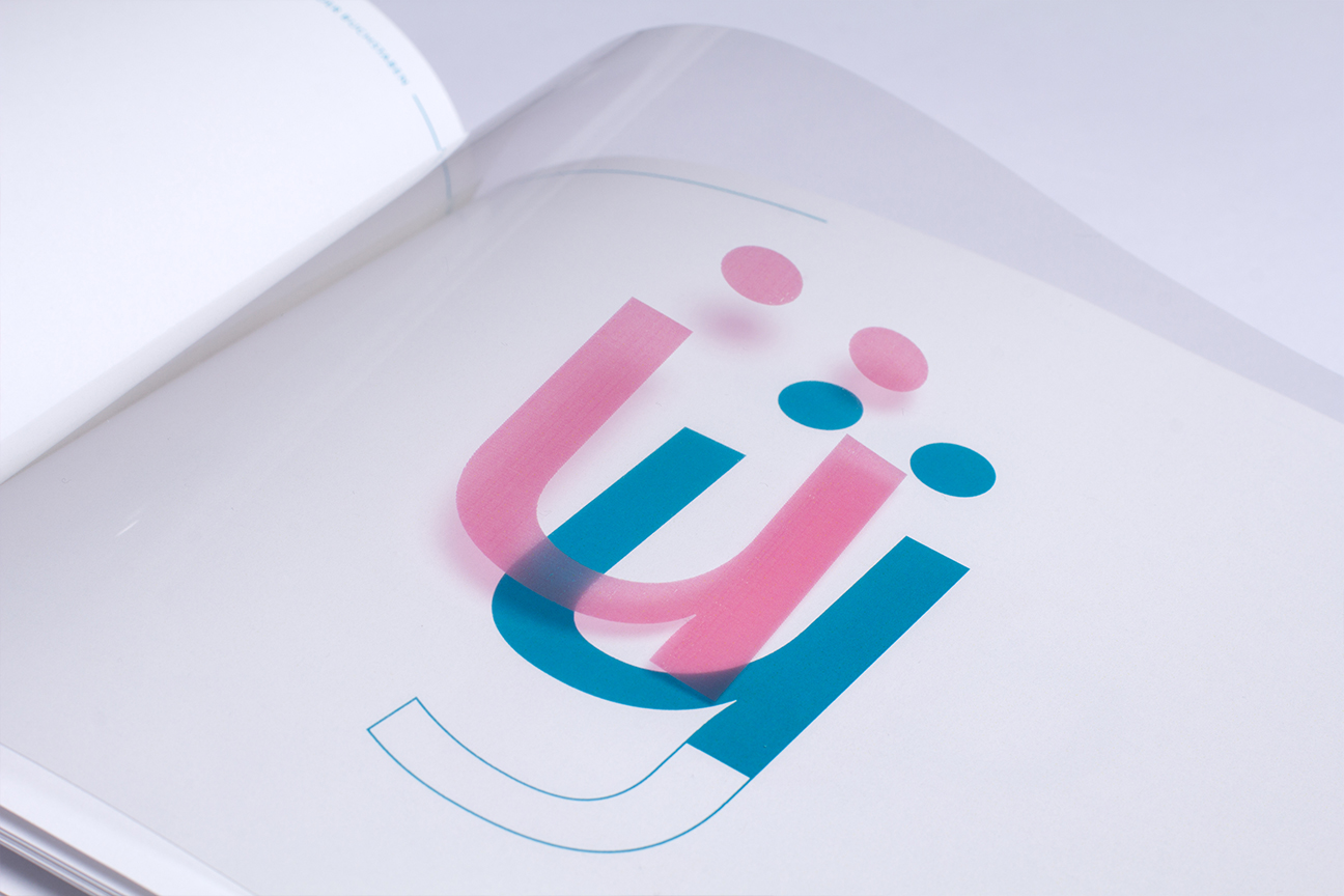
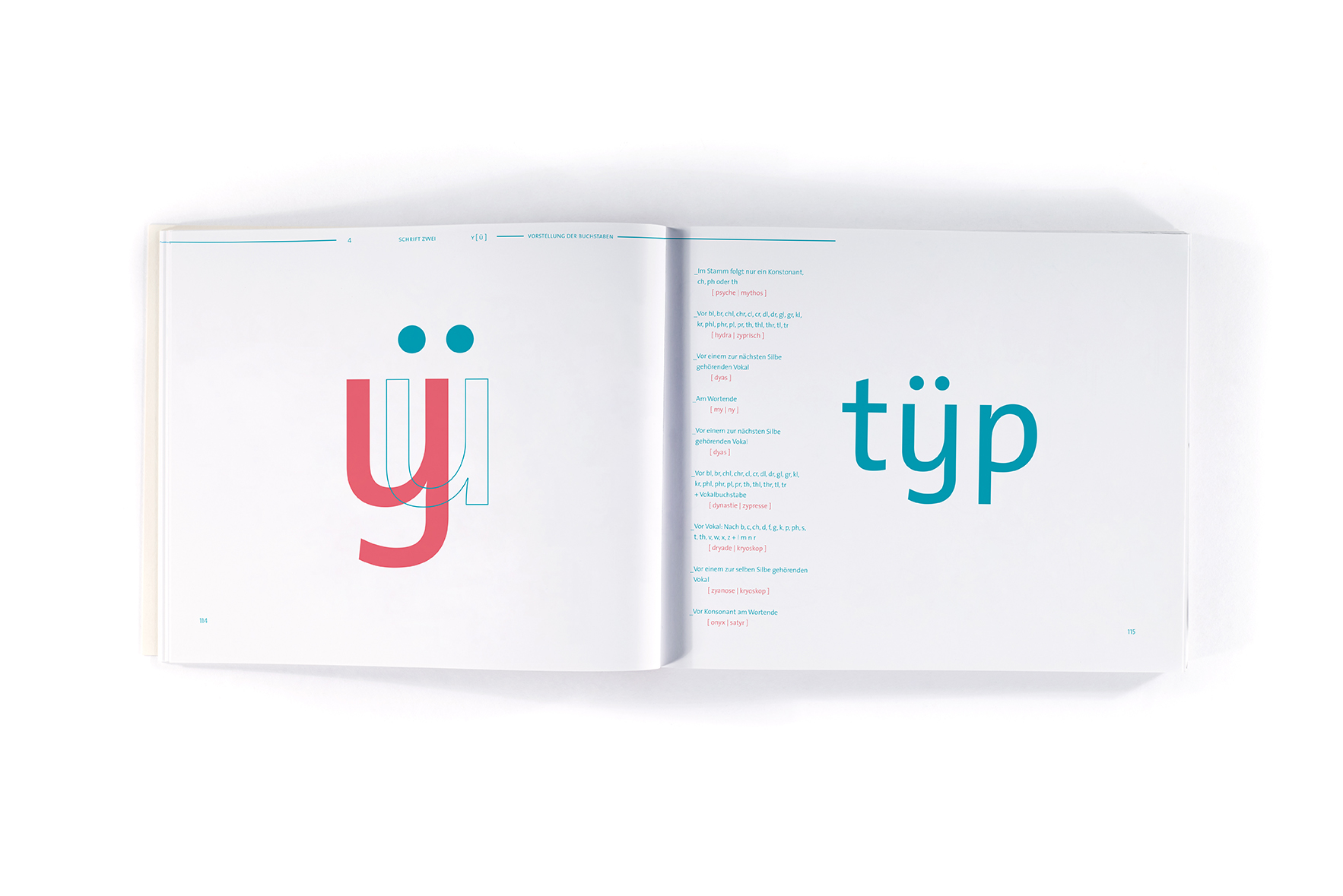
In the phonetic font, letters are replaced with specifically altered versions that show the pronounciation of the letter in the context of a word.
In the phonetic font, letters are replaced with specifically altered versions that show the pronounciation of the letter in the context of a word.
︎
When one letter has two different phonems, these are almost exclusively owned by other letters that only have this one phonem. Therefore two alterations of the letter with two phonems are created: one fusion with the letter of the first and another fusion with the letter of the second possible phonem.
︎
Phonems that are constituted by two letters are visualized with specifically designed ligatures.
Phonems that are constituted by two letters are visualized with specifically designed ligatures.
︎
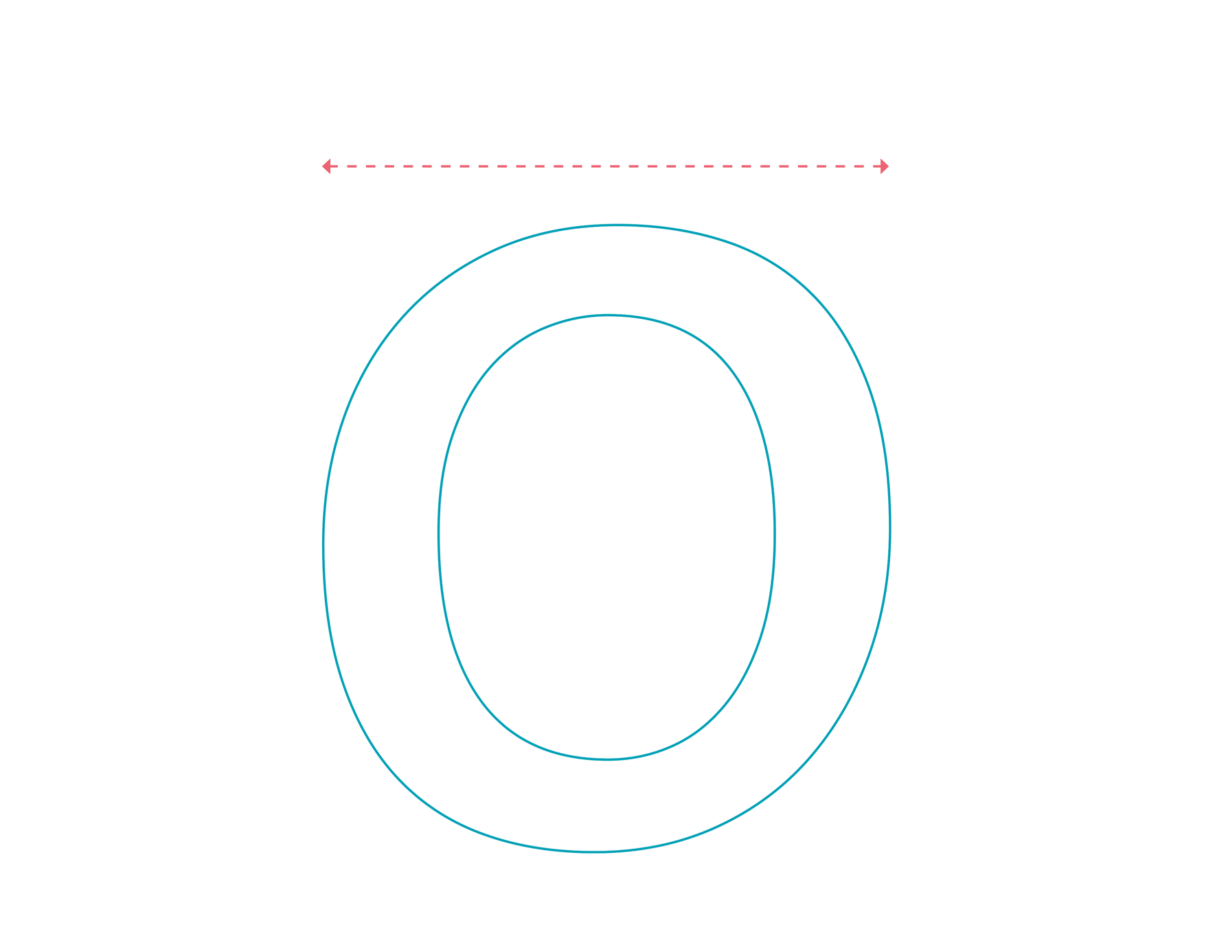
The length of the pronounciation is shown through expansion or shrinking of the letter.
The length of the pronounciation is shown through expansion or shrinking of the letter.
︎
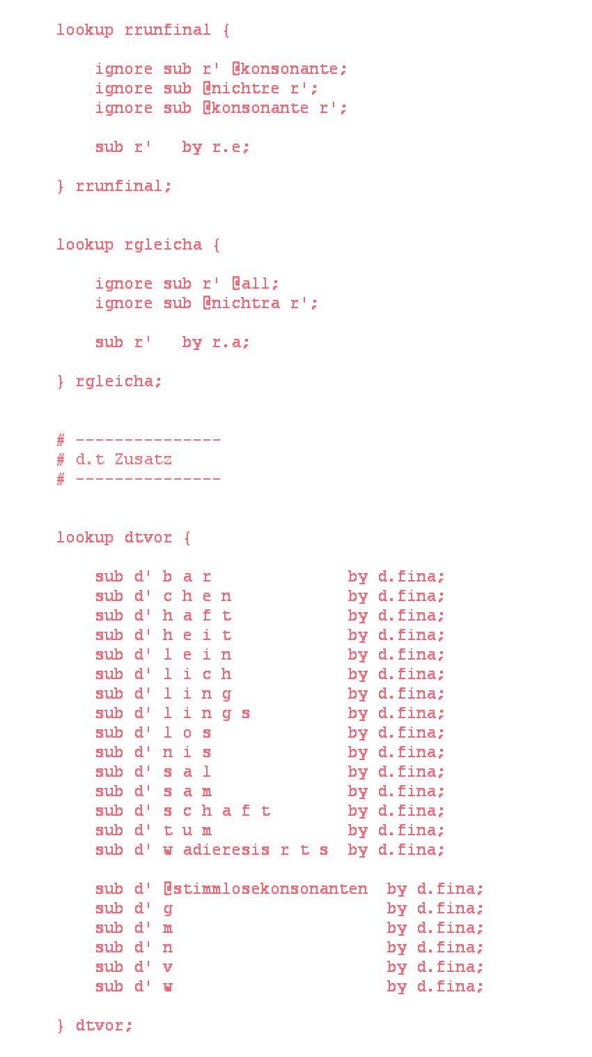
I programmed the replacing of the letters into the unicode file, so that the letters are replaced automatically.
I programmed the replacing of the letters into the unicode file, so that the letters are replaced automatically.


︎︎
EVALUATION
After finishing the project I realized that such a font might not confront the real problem that deaf people are facing, which is the missing sensibility for and acceptance of inequality. Helping people who cannot hear to speak like somebody who can hear might not be the type of equality we should aim for. The better way would be to create acceptance of this existing inequality rather than trying to eliminate it.